
Overview
The An Phúc Visual Identity Project is a comprehensive branding engagement delivered in April 2026. The objective was to create a modern, elegant, and timeless brand identity that communicates serenity, trustworthiness, and sophisticated craftsmanship.
Design Concept & Philosophy
The brand mark is structured around sacred geometry and organic symmetry:
- Core Symbol: An interlocking geometric motif that seamlessly combines floral elegance with modern architectural balance, evoking prosperity, peace, and longevity ("An" - Peace, "Phúc" - Blessing).
- Color Palette: A deep, luxurious emerald green paired with warm gold and crisp neutral tones, conveying prestige and natural harmony.
Brand Assets & System Deliverables
1. Logo Variations
- Primary Horizontal Wordmark: The official combination of the symbol and balanced serif typography for corporate stationery and signage.
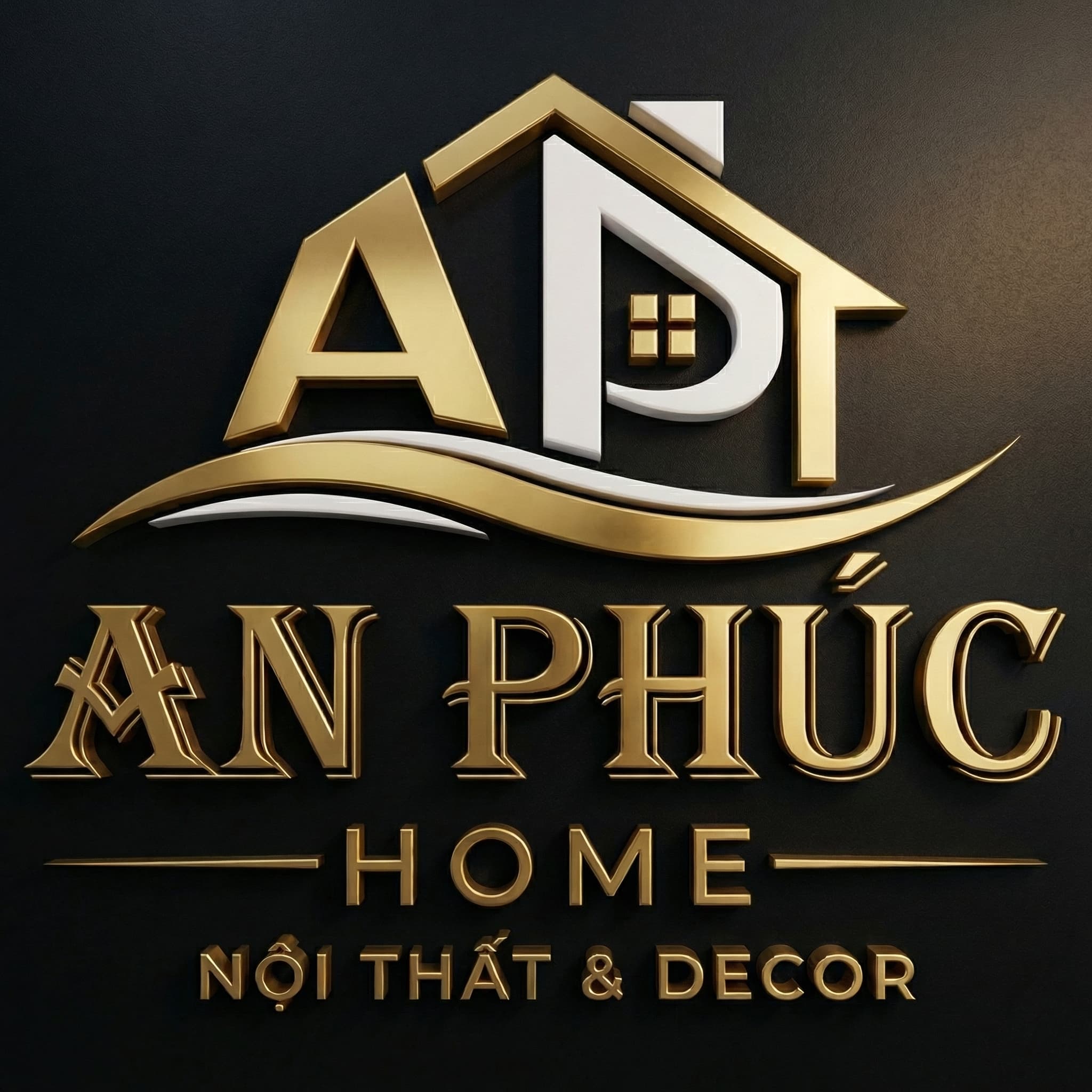
- 3D Embossed Luxury Emblem: Rendered in high-resolution with realistic surface lighting, specular highlights, and depth shadows for premium marketing collateral.
- Circular Submark: Designed specifically for small-scale applications, such as product seals, wax stamps, social media profile avatars, and app icons.
- Monochrome & Inverted Variants: High-contrast black-and-white vector versions optimized for laser engraving, embroidery, and official document watermarking.
2. Tools & Standards
- Developed entirely in vector format using Adobe Illustrator and high-fidelity texturing in Adobe Photoshop.
- Prepared comprehensive vector deliverables (.AI, .SVG, .EPS) and raster exports (.PNG with transparent alpha channels) categorized for print and digital ecosystems.